
Chart Options
If you have chosen to display a chart, by choosing "Pivot Chart" or Both in the main Configuration toolpart, then you can use the Chart Options toolpart.

Position
If you are showing Both a Pivot Table and a Pivot Chart you can choose to display the chart Above, Below, to the Left or to the Right of the table.
Rendering
Starting with version 4.1.0 PivotPoint can display charts using JavaScript rather than Adobe Flash. By default it will use JavaScript automatically for SharePoint 2013 and above but still use Adobe Flash for SharePoint 2007 and 2010 due to browser compatibility issues.
Not all options are available in JavaScript charting and will be grayed out - for example "Explode Pie Chart", "3D", "Vertical Labels" etc.
Chart Type
You have the option of Line, Column, Bar, Area, Pie, Doughnut and Funnel
Width & Height
You can set the chart width and height as Auto (best for most circumstances) or a specific width in pixels.
Font Size
You can change the font size used for labels on the chart - the pivot table has separate settings for font sizes.
Sum Series, Flip Axis and Show Stacked
These three options are related and will be covered together.
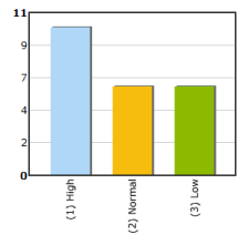
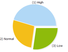
Some charts (such as Bar and Column charts) can display multi-dimensional data - e.g. a list of sales by Year and Product. However on your graph you may only want to show a single dimension (e.g. Sales by Product) so you can use this option to sum multiple series data into single series. This will be automatically elected for chart types that don't allow multiple series such as a Pie Chart.
| For example given the following Pivot Table that shows helpdesk tickets in progress by Priority and Assigned Engineer :- |  |
|
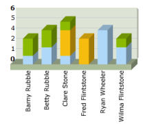
You can show this as a Column chart showing both the priority and the assigned engineer.
|
|
|
Or using Sum Series showing just the total number of assigned cases per engineer. You may also find the "Show Stacked" option useful, see below. |
|
|
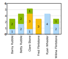
If you select the Flip Axis option the axis will be reversed - summarising by Priority rather than Engineer. |
|
|
For this type of chart perhaps a better option is to un-check Sum Series and select Show Stacked - which will allow you to easily see both the total number of tickets assigned and how many are High, Medium and Low priority. |
|


Axis Minimum
By default the chart axis will start at zero, but you can change that using the Axis Minimum option. This is useful for emphasising small differences if your data points are very close. Note that if any values are less than the axis minimum, the minimum will be ignored.
Axis Maximum
By default the chart scale will be chosen automatically, but you can change that using the Axis Maximum option. Note that if any values are greater than the axis minimum, the minimum will be ignored.
Number of Division Lines
The chart works out the number of division lines (horizontal or vertical lines to show scale) to show automatically but this can be manually specified if necessary. This can be used in combination with the Axis Maximum option if the auto values are not satisfactory particularly with small numbers.
Vertical Layout
Some charts, such as the Bar and Column, can show labels vertically - which can make them easier to read if you have many labels in a small area.
Show ValuesYou can show the data values on the graph. If you choose the auto-scale option then the values will be scaled appropriately, e.g. 10,500 will become 10.5K etc. |
 |
3DSome charts (Column, Pie & Funnel) can show the charts with a 3D effect. |
 |
Animate Chart
You can choose for the chart to use a short animation when the page first loads.
Explode Pie Chart SegmentsWhen using the Pie charts you can highlight important segments by 'exploding' them. You can explode multiple segments by separating them with a comma. |
 |
Color Mappings
By default the colours for different series are chosen automatically. However you can set a particular series to use a certain color - which may be helpful if you want to emphasize a particular series for example.
|
To select a custom colour mapping :-
|
|
|
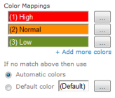

If no match to your custom color mapping can be found then the chart will either use an automatically chosen colour, or a default colour you've selected.
